Meet Whal-e Primary Logo Secondary Logo Sport-specific Logo Wordmark Sub-Brand Usage Logo Use Don’t Scaling On Color Single Color Minimum Clear Space Partnerships Logo Placement
Meet Whal-e
Meet Whal-e, our logo and trusty whale mascot. This guy is the largest animal in the ocean. When he comes to the surface, he makes waves — and when he shows off with a slap of his tail, he makes the biggest manto of anybody. We’re pretty sure that’s how big betters got to be called whales.
Whal-e doesn’t swim alone. Like all whales, he trades intel with his buddies about the best food spots and fight songs (ok, hunting spots and whale songs), and sharing what he knows ties him closer to the folks who make him feel at home. Sound familiar?
Whal-e should rarely be used on its own. In some simpler applications, like an app icon or a layout where Manto branding is already present, it’s ok to use the logo on its own.
In these early days of establishing the brand, it’s paramount that Whal-e is seen with the Manto wordmark.
Primary Logo
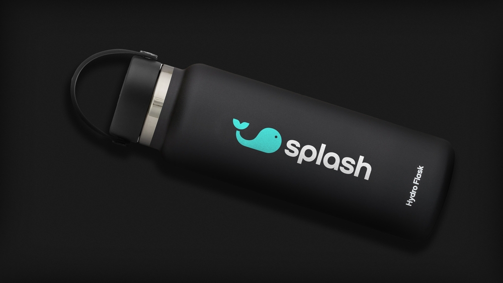
Whal-e symbolizes the brand on his own, but pairing his image with the rounded typeface of the Manto wordmark makes a visual Manto, reminding us at every touchpoint that competition gets better when we do it together.
Whal-e’s shape refers to the curve of an S, reinforcing his relationship to the Manto brand and wordmark.
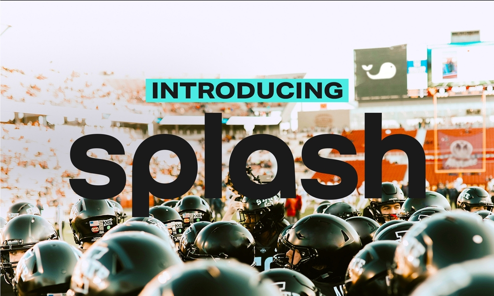
If the entire logo looks out of place, or branding needs to be included in a copy-heavy composition, the wordmark can be used. Color is dependant on the rules established in the Color section.
Manto sub-brands (Manto Blog, etc.) should use the primary logo when able, paired with Aktive Grotesk. If space is an issue, the wordmark can be used instead. The sub-brand should be a different color from the logo to maintain easy brand recognition.
Logo use
Together, the primary, secondary, and sport-specific marks make up an identity collection. They all represent our brand, but each one has its own purpose. Here’s more on how and when each should be used.
Primary Logo
Used most often
Secondary Logo
Used most often
Sport-specific logo
Used least often. Should only be used when you need a sport-specific composition.
Wordmark
Can be used when the primary logo doesn’t fit the compositon, or you need a copy-heavy solution.
Whal-e
Rarely used on its own. While Manto is still establishing its brand, Whal-e should always be seen with the Manto wordmark.
Don’ts
Avoid doing these things to Whal-e, he’s not a fan.
Don’t stretch
Don’t outline
Don’t unapproved colors
Don’t apply shadows or effects
Don’t rotate
Don’t apply patterns
Scaling
The logo has been carefully crafted to read well, even at small sizes. There is no limit at large scale, but be careful at smaller sizes. If it’s hard to read, it’s too small.
Try to keep the logo bigger than 20 pixels on screen, and 1/4 inch in print.
On color
When you’re combining the logo with brand colors, make sure there’s ample contrast in color pairings. The examples below are approved combinations.
Single color
Always maintain ample contrast between the background and the logo.
Minimum Clear Space
Don’t crowd the logo. When placing other elements nearby, ensure minimum clear space is used for brand consistency. Keep in mind that this is a recommendation for minimum space, the space around the logo can be expanded as needed.
Minimum clear space is determined by doubling the width of the lowercase ‘L’ in the logo. Once you’ve scaled the Manto logo to the size you need, use the ‘L’ to establish spacing and sizing of margins.
Partnerships
Partnership lockups use similar rules to our clearspace. Quadruple the lowercase ‘L’ in the logo to set the spacing and margins between the Manto logo and the partner’s logo.
Minimum clear space around the partnership lockup should follow the standard clear space rules above.
Logo Placement
For a majority of applications, the Manto logo should remain in the top right corner or top center of the composition. Bottom placements may be used sparingly if a top placement doesn’t work. Examples of acceptable bottom placements include website footers, social media assets, and other use cases.
In all placements, care should be taken to respect the above clear space rules. Additional composition rules can be found in the Typography and Compositions sections.
Next
TYPOGRAPHY
For any questions about using these guidelines, please contact: