Introduction
Primary Typeface
Supporting Typeface
Setting Type
Hierarchy
Emphasis
Principles
Testing type
Our voice is simple, casual, and loud enough so everyone can hear. So is our type. Its clear but playful visual elements bring our persona to life.
Aktiv Grotesk Extended XBold is our primary typeface. A neutral but authoritative grotesque, its angled terminals make the letterforms feel in motion and at play.
Aktiv Grotesk Extended XBold is used in headlines and subheads, and any other text that needs extra attention. Headlines should be set in all-caps.
Aktiv Grotesk Extended
XBold Dalton Maag
ABCDEF
GHIJKL
MNOPQ
RSTUVW
XYZ
abcdefg
hijklmno
pqrstuv
wxyz
012345
6789
!@#$%^&
amp;*()?
Inter Light is our supporting typeface. A flexible sans serif with tall x-height, it’s super easy to read. It also ties marketing materials back to the product, as it’s the primary typeface in our app.
Inter Light is used for all body copy, and in any applications that call for a smaller type size.
Inter Light
Rasmus Andersson
ABCDEF
GHIJKL
MNOPQ
RSTUVW
XYZ
abcdefg
hijklmno
pqrstuv
wxyz
012345
6789
!@#$%^&
amp;*()?
Setting type
When you’re setting type, keep the leading (the space between lines of text) consistent across applications.
You can calculate leading with these formulas. Type sizes are for example only.
Headline
Aktiv Grotesk Ex XBold
80/88pt
All Caps
Type size × 1.1 = leading. Headlines at 80pt would have 88pt leading.
Subhead
Aktiv Grotesk Ex XBold
30/36pt
Sentence case
Type size × 1.2 = leading. Subheads at 30pt would have 36pt leading.
Body
Inter Light
15/21pt
Sentence case
Type size × 1.4 = leading
Body copy at 15pt would have 21pt leading.
Size, scale, and position all play a role in how users read information. Make sure that there’s always a purposeful difference between type sizes. The type sizes displayed here are examples only.
Headline
Aktiv Grotesk Ex XBold
80/88pt
Sentence case
Headlines nulla vitae euismod sem. Integer ut vehicula mauris.
Subhead
Aktiv Grotesk Ex XBold
30/36pt
Sentence case
Subheads suspendisse aliquet at dui eu pellentesque. In dui turpis, mollis vel est ullamcorper, bibendum consectetur massa.
Body
Inter Light
15/21pt
Sentence case
Body phasellus at ornare mauris, eu viverra tellus. Curabitur sit amet lorem lorem. Praesent vel turpis ex. Pellentesque in felis ante. In massa dolor, porta sed dictum non, gravida et urna. Phasellus imperdiet ligula eu neque blandit, vitae lacinia augue consequat.
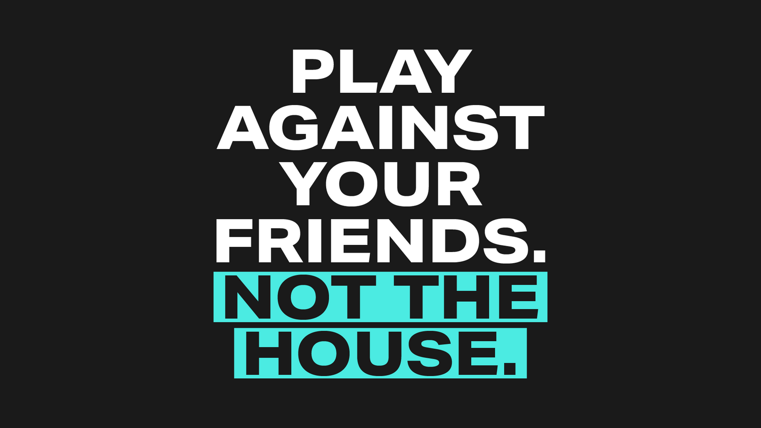
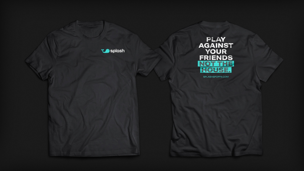
Emphasis
If you need additional emphasis on a piece of text, you can use a block of color behind the type or change the color of the typeface. The color blocks bring a playful element to the composition, while changing the color of the typeface is more reserved. Use this tact sparingly — once per page or above the fold instance at most.
Emphasis can be added to multiple words based on how the line needs to be read, or what needs to be emphasized visually.
This is a guide that outlines general typesetting principles. Use them as a reference any time our typefaces are used. Also refer to the Composition Section for grid usage.
Body
Inter Light
15/21pt
Sentence case
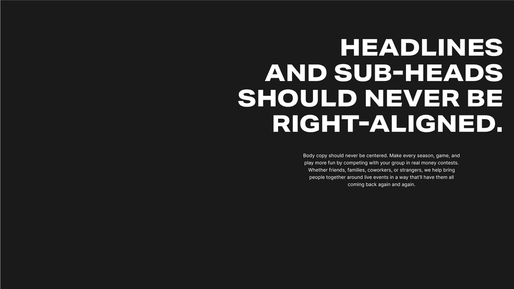
Headlines and sub-heads can be centered if the composition calls for it, but never right-aligned. Body copy should never be centered, only left-aligned.
Headlines may be centered if needed. Body copy should always be left-aligned.
Don’t right align headlines or sub-heads. Don’t center body copy.
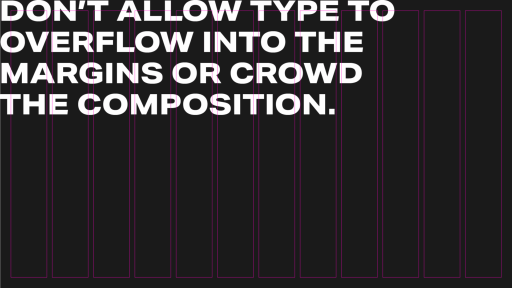
Always align typography to the grid.
Always align typography to the grid.
Don’t misalign type from the grid or allow elements to float.
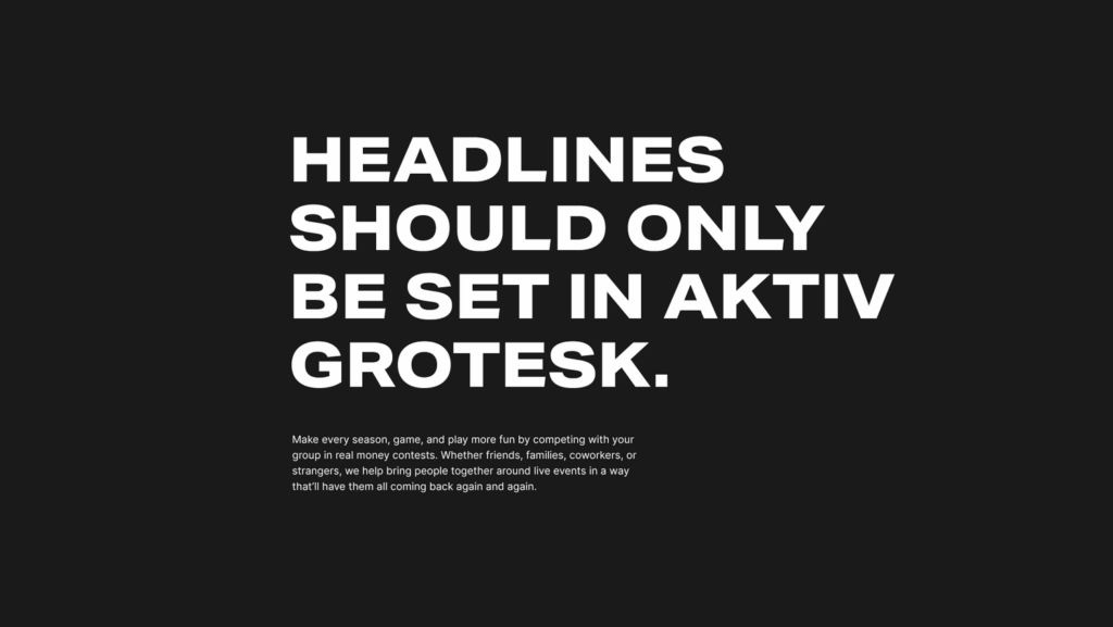
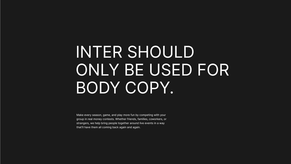
Headlines should only be set in Aktiv Grotesk. Inter should not be used for anything other than body copy.
Always set headlines in Aktiv Grotesk.
Don’t set headlines in Inter. Inter is only used for body copy.
Choose a type field to test out individual typefaces in our type family.
Headline
Aktiv Grotesk Ex XBold
80/88pt
All Caps
Subhead
Aktiv Grotesk Ex XBold
30/36pt
Sentence case
Body
Inter Light
15/21pt
Sentence case
Next
COLOR